
1st Blog, 1st degree course; Oh my!
This is going to be an epic journey, I can’t wait.
Just FYI this little fellow is a grasshopper I saw when I lived in Florida, I couldn’t get a lower angle because it kept head butting me every time I tried.
This is the post excerpt.
This is going to be an epic journey, I can’t wait.
Just FYI this little fellow is a grasshopper I saw when I lived in Florida, I couldn’t get a lower angle because it kept head butting me every time I tried.
Well, this is the end of this section.
I didn’t do as well as I thought but a pass is a pass I suppose.
This being my first time in school for almost forty years is a daunting prospect and this first introductory assignment was tough for me.
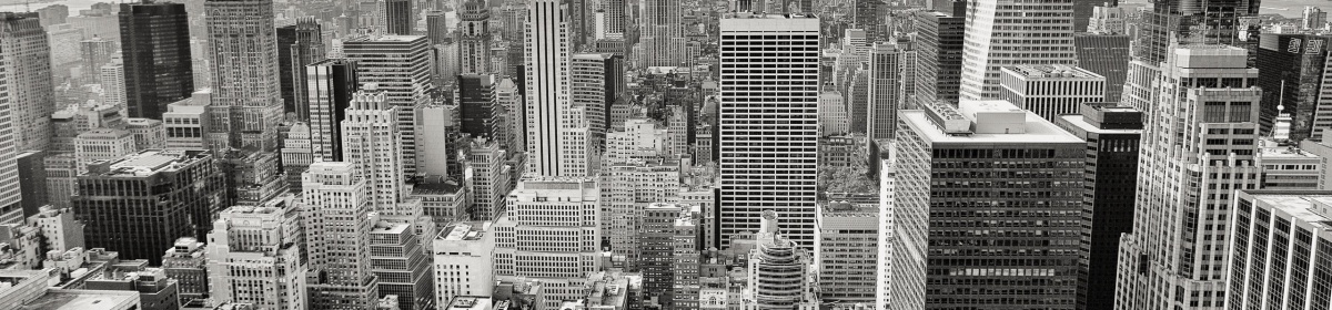
Let me be clear here, I don’t like London; It’s full of noise, pollution and people who have no clue where they are ( just ask a local for directions to somewhere ) and the traffic is insane.
But it’s where I ended up after two years of homelesness.
So bearing that in mind I was given the above brief.
What would or could I do when I have no attachment to the city I’m living in?
I decided to approach it from the idea London conjured up in my mind and tried to express what it is to me and what views others may form of it.
The equipment I used for all these Photo’s was the same, a Nikon D5200 and the kit 18-55 mm lens.
All of the images were lightly post processed using Photoshop CC and lightroom CC.
Mainly a little horizon levelling, a small ammount of sharpening and some cropping where necessary.
I didn’t do any research for this first assignment as it’s a none scoring section and I had to devote many hours in getting up to speed on Photoshop CC and Lightroom CC both by Adobe.
I’d used Nikon Capture NX2 previously and still prefer it over Phoshop and View NX blows Lightroom away, at least for the light editing I do.
I also had to devote a lot of time working out WordPress.
Most of my references to these three programs, I’m old skool I don’t call them apps; where mainly on you tube.
I have found Chelsea and Tony Northrup’s you tube chanel and the two books I purchased on the Adobe programs to be invaluable.
Their Weekly videos are very entertaining and informative.
I also watched various videos from Jason Lanier and a TV show on BBC4 about the beginnings of British Photography.
As previously stated I spent an awful ammount of time and money getting up to speed on the Industry standards, Lightroom CC and Photo shop CC both by Adobe.
Compared to Capture NX2 by Nikon they are very complexed and not as intuitive, I have still to find an easy and quick way to level the horizon in Lightroom CC for example.
What went well ? The photo with the lady and the pram turned out much better than I could’ve imagined considering I was hand holding at a low shutter speed and using a technique I’d never attempted before.
What went Poorly ? a lot, I still have a lot of shots with camera shake in them which I’ll have to concentrate more on eliminating and I still have a lot to learn regarding software such as Adobes Photo shop CC.
Did I meet the criteria for the assignment ? I think so but as usual I’m my own worst critic, nothing is ever good enough and I have a lot to learn.

The lost.

The homeless.

The kind.

The young.

The traffic.

The relaxed.

The game.

The Law.

The Thames.

The scary.

The war scarred.

The memorials.

The Proof sheet.
Make a series of six to twelve photographs in response to the concept of ‘The SquareMile’.
Use this as an opportunity to take a fresh and experimental look at your
surroundings.
You may wish to re-trace places you know very well, examining how they might have changed; or, particularly if you’re in a new environment, you may wish to use photography to explore your new surroundings and meet some of the people around you.
For my response to my tutors report (see above link) for Assignment two I decided to re-work it totally.
I decided to go with a subject more in line with Tony Ray Jones and his work on the English at play.
I also decided to go with photographs I took whilst in Australia, while on holiday I had intended to work on sections four and five anyway.
I also did this for two other reasons :
1. I wanted to use photographs that used my skill set from nearer that period of my learning.
2. It was a time-saving measure.
Not Ideal I know but there you have it.
My subject is Australians at play.
I used mainly my 70 – 200 mm. lens and dealt with the harsh Australian sunshine as best I could.
The images are lightly processed and some are cropped to lessen unimportant dead space within the frame.
For this assignment I looked at Tony Ray Jones and his images of the English at play but turned it upside down, globally speaking and made it into Australians at play.
His style and subjects are what get my juices flowing.
They are well executed and very well framed.
As he explained to Creative Camera in 1968:
“I have tried to show the sadness and the humour in a gentle madness that prevails in a people. The situations are sometimes ambiguous and unreal, and the juxtaposition of elements seemingly unrelated, and the people are real. This, I hope helps to create a feeling of fantasy. Photography can be a mirror and reflect life as it is, but I also think that perhaps it is possible to walk, like Alice, though a Looking-Glass, and find another kind of world with the camera”.
I also watched a biography on Harry Benson which shows what is possible when you get really close to your subjects.
See my assessment of Harry Benson at this link:
https://ashley516543.wordpress.com/2018/04/09/harry-benson-shoot-first/
In keeping with T R Jones I tried to select shots that showed the humour and generosity of the Australian people.
The first image of the couple in the waterfall could only have been tighter if I was prepared to go swimming with my camera.
It shows what Aussies do when it gets hot, they find some water and go jump in it.
Image two shows Mum and Dad retrieving their children from a precarious spot, it also shows how families stick together and help each other out.
The sheer cliff face and the overhang together with the groups pose adds drama to the shot, it could have been taken a little closer but I think you’d lose the drama without the size of the cliff being apparent.
Photograph three shows a more relaxed family event.
I like this image for many reasons from the groups pose, the location and the eye contact between the man and woman.
The image of the man pointing is another of my favourites that I took, it shows Dad explaining where they used to live by pointing to Brisbane off in the distance.
I used a shallow depth of field to make the city skyline appear dream like, as if they’re looking into the past.
I did try changing the angle on these guy’s but I tended to lose the skyline before I could get all three back in frame.
The last two show how generous of their time Aussies are for charities.
The first is a Girl volunteer with the Australian Red Cross and the second but definitely more humorous are the forest fairies drawing people’s attention to environmental issues.
I only have two images here that equate even remotely to Harry Benson’s work and only one where I got the subject to crack a smile despite the torrential downpour we were in.
This I will try harder to do.
As for the technical aspects of this series I used a telephoto lens to compress space in all but one of this series.
I used this lens just because of the topography but also to make it seem like you’re in the scene yourself, a participant so to speak.
The effects you get at lower F stop numbers is really good and helped me show just enough of the back ground and foreground as was pertinent to the images and what I wanted the viewer to focus on.
I think overall this went well, I don’t have so many shot’s with technical errors or things appearing in the frame which were unintended.
This is really good considering it will be some time before I can return to the land down under.
I spent three months down under and only encountered one homeless person so I don’t have many shots of the sadness that Jones and I have found in England.
I do however have a load of happy people images which leaves me with as positive an impression of Australians as they seem to portray.
I wish to go there again as the variety of scenery, flora and fauna is mind boggling.

200 mm. 1/500th. sec. f 5 ISO 100

200 mm. 1/60th. sec. f 5 ISO 100

200 mm. 1/400th. sec. f 2.8 ISO 100

200 mm. 1/2500th. sec. f 2.8 ISO 100

70 mm. 1/60th. sec. f 8 ISO 3200

200 mm. 1/40th. sec. f 8 ISO 400
Create a series of between six and ten photographs from one of the following options, or a subject of your own choosing:
• Crowds
• Views
• Heads
Use the exercises from Part Two as a starting point to test out combinations of focal length, aperture and viewpoint for the set.
Decide upon a single format, either vertical or horizontal.
You should keep to the same combination throughout to lend coherence
to the series.
• Crowds make a great subject for photography, not least because they are so contemporary.
A city rush hour is a good place to start but events also offer great
opportunities to photograph the crowd rather than the event.
The foreshortened perspective of the telephoto lens will compress a crowd, fitting more bodies into the frame, but it can also be used to pick out an individual person.
A wide-angle lens can capture dynamic shots from within the action.
• If you choose to make a collection of views you need to be prepared to do some walking so keep the weight of your equipment to a minimum – you’ll walk further and see more.
A tripod will be important to allow you to select a combination of small aperture and slow shutter speed to ensure absolute sharpness throughout the frame.
The weather and time of day will be crucial, whether for urban or landscape
views.
A wide-angle lens is the usual choice but Ansel Adams also used a medium
telephoto to foreshorten the perspective, bringing the sky, distance and foreground closer together.
• Heads: Frame a ‘headshot’, cropping close around the head to avoid too much variety
in the backgrounds.
The light will be paramount and a reflector is a useful tool (you can ask the subject to hold it), throwing light up into the face, especially the eyes.
The classic headshot is buoyant but neutral which is quite difficult to achieve, but try to achieve a natural rather than an artificially posed look.
Assignment notes
Send your photographs to your tutor accompanied by assignment notes (500–1,000 words) containing the following:
• An introduction to your subject.
• A description of the combination of aperture, focal length and viewpoint you’ve used, and how they affect the images.
• An evaluation. You’ll want to evaluate the technical aspects of your assignment, but it’s also important to evaluate how well the series works as a whole.
When writing your evaluation, use the following structure: what worked well, what didn’t work so well and how the series might be improved in the future.
Include a link (or scanned pages) to any exercises from Part Two in your learning log that you’d like your tutor to comment on.
Reflection
Check your work against the assessment criteria for this course before you send it to your tutor.
Make some notes in your learning log about how well you believe your work
meets each criterion.
Your tutor may take a while to get back to you so carry on with the course while you’re waiting.
For this assignment I stayed in and around various parks in London observing the various bonds made between both humans and animals.
The making of friends, the forming of relationships is perhaps the most decisive moment of our lives.
Nothing has as profound an impact on us as social creatures as a friend or partner, be they human or pet.
The research for this assignment has already been covered in exercises 3+.
This assignment took me longer to form my thoughts than I would have imagined.
I thought long and hard over this assignment and it took a lot longer to complete than I first thought it would, due partly to a financial crisis that struck which required me to sell all of my photographic equipment.
Fortunately I came into some money and bought new stuff which took some time to get used to.
At first I was thinking the decisive moment was recording a climactic moment, such as a goal in a football match; but soon thought deeper on the subject.
Let’s take a quote from Swarkowski.
“The decisive moment is not a dramatic climax but a visual one: the
result is not a story but a picture”.
(Swarkowski, 2007, p.5)…….
He is wrong! it can be both and more, such as human relationships and interactions.
Another quote from the OCA text-book.
“You know it’s funny. You come to someplace new, and everything
looks just the same”.
(Eddie in Stranger Than Paradise, Dir. Jim Jarmusch, 1984)…..
I think this is also wrong, characters are often similar but the scenery is never the same.
It came to me one afternoon that the making of friends, the forming of relationships is perhaps the most decisive moment of our lives.
Nothing has as profound an impact on us as social creatures as a friend or partner, be they human or pet.
I hope I’ve shown just some of the facets of friendship.
Friends help you out, make you laugh or just keep you company and much more.
These photo’s were taken at parks or on the way to parks in my neighbourhood.
They were spontaneous, not planned; I went out over a period of weeks to get good photo’s that fit my theme.
After all you can’t plan decisive moments, they just happen.
The tourists that are lost, looking at their smart phone for directions was taken from a foot bridge; I decided to leave the image uncropped as I felt the space around them helped to convey the feeling of being lost in a strange place.
The Police women and their mounts standing shoulder to shoulder I think is a sign of their support for one another, their resolve if you will.
The children eating Ice cream together is a perfect example of a bonding situation and a decisive moment of peace for the adult.
The others were all chosen for their expressions.
Have I succeeded in what was set for me to do ?
I think so but we’ll see if my tutor agree’s.

Making a plan.

Shoulder to shoulder.

Ice cream.

Chin rubs.

Chat in the park.

Recording success.

New friends.
Humour, you either get it or you don’t.

A helping hand.

A good joke.

Contact sheet.
1. Prints
Submit a set of between six and eight high-quality photographic prints on the theme of the ‘decisive moment’.
Street photography is the traditional subject of the decisive moment, but it doesn’t have to be.
Landscape may also have a decisive moment of weather, season or time of day.
A building may have a decisive moment when human activity and light combine to present a ‘peak’ visual moment.
You may choose to create imagery that supports the tradition of the ‘decisive moment’, or you may choose to question or invert the concept. Your aim isn’t to tell a story, but in order to work naturally as a series there should be a linking theme, whether it’s a
location, an event or a particular period of time.
2. Assignment notes
Submit assignment notes of between 500 and 1,000 words with your series.
Introduce your subject and describe your ‘process’ – your way of working. Then briefly state how you think each image relates to the concept of the decisive moment.
This will be a personal response as there are no right or wrong answers in a visual arts course.
You’ll find it useful to explore the photographers and works referenced in Project 3, if you haven’t already done so.
Don’t forget to use Harvard referencing.
Post your prints, no larger than A4, to your tutor together with your assignment notes.
Reflection
Check your work against the assessment criteria for this course before you send it to your tutor.
Make some notes in your learning log about how well you believe your work meets each criterion.
Your tutor may take a while to get back to you so carry on with the course while you’re waiting.
For this assignment I decided to revisit exercise 4.3, capturing the beauty of artificial light.
I again went out at night to try to capture some of the aspects of night-time London, showing the transition from the hustle and bustle of day time to peaceful night.
I used several lenses, a 24-70 f2.8, a 70-200 f2.8 and an 85 f1.4 either hand-held or on a tripod.
When using the tripod I used the cameras self timer function rather than carry a release cord.
I went to Putney bridge and along the Brompton rd. over a period of several days to find images that fit my idea.
Using low ISO and a tripod is the best way to take clean images but is not always practical.
I found that on some streets they have a mix of sodium and L.E.D lights, the council must be replacing the sodium as they break; this means that I had to be selective in my locations as the white balance can’t be corrected as you end up with either a yellow or green tint to your pictures.
I have added these in a separate section in my notes section of my blog.
The images I produced for this assignment fit my idea well but I feel that the images of the girl at the phone box and the river slipway were the most technically challenging from a white balance and exposure point of view.
The phone box image is lit with both sodium and LED street lighting which gave me headaches in post and was also fairly dimly lit bringing up problems of noise.
I think I spent more time on this in post than the rest in order to get a good balance to produce a decent image.
The slipway despite being taken at a low ISO showed a fair amount of noise in the shadows and was tricky to get a good balance of sharpness and noise reduction.
For this assignment I looked at works from Sally Mann, whose works have a dream like quality to them.
ethereal and almost like they were shot through silk.
I also looked at Sato Shintaro’s work which are very colourful and full of leading lines.
None of these fit my idea for the assignment.
Ruth Blees did a series for the London underground that was more of a match and I did try to include some images with reflections in them.
Her series on night-time London didn’t resonate that well with me but some of my images may have been influenced by this work also.
I also Googled famous urban photographers for some inspiration.
The light trails of Mathias Makarinus were good and I tried to emulate some of those but to include reflections on water in the same shot much like Veronika Gallova’s night shots of London.
When I first dipped my toe into the photographic pool many moons ago the general theory was “when in doubt, fill your frame with the subject”.
Since then I have discovered better ways of composition such as the rule of thirds, which are meant to give a more balanced or pleasing shot.
When I looked at my images on an individual basis they worked well with my ideas and aims for this assessment but when I look at them as a whole I noticed that none of them obeyed these rules.
This reminded me of the saying ” Rules are for the obeyance of fools and the guidance of wise men” often attributed To Douglas Bader but I’m sure goes farther back in time than that.
Image 1 was meant to show the city as a dark, cold and mysterious place and does portray that feeling.
I think it could do with me standing slightly more to my right in order to centralise the slip way more but overall it accomplished what I was aiming for.
Image 2 would’ve been better with less dead space on the right of the image but as there was going to be enough noise in the image at the ISO selected cropping wouldn’t have been beneficial, also I wanted to portray the girl being on edge and waited until she was near the curb and at the edge of the frame.
Image 3 would’ve been better showing more of the street but this would’ve introduce more clutter in the image from street furniture and I wanted to keep the image as simple as I could.
It also reminded me of exercise 1.3 on perpendicular versus leading lines, this has both but instead of your gaze going out the frame it is stopped by the perpendicular of the railings; concentrating your gaze on the abandoned umbrella.
Image 4 was originally going to be for an experiment in image staking with Photoshop but the more I looked at it the more I realised that it portrayed another aspect of the city at night, tranquility.
It does have leading lines that lead to no-where but a timeless infinity but I don’t think that this detracts from the image in this case.
Image 5 would’ve been better taken straight on but I didn’t want to risk changing the behaviour of the man in the cafe.
Image 6 works well in what I’m trying to show, something at rest which normally would be ahead of the things passing it by; it would’ve been better a little tighter but that would draw the viewers gaze to the dirty fuel tank and diminish what I was trying to achieve.
Image 7 needs less clutter in the background but was already at minimum focus distance and widest aperture, in retrospect I should’ve shot it in a vertical format and this may have reduced the distracting clutter.
Image 8 needs to be a little tighter and would’ve benefited from me taking a few steps to the right in order to get the building straight on.
Image 9 is stayed but was included because I like the lighting and reflections, It would’ve been better straight on and from the pathway below the bridge but the gates are locked at this time of night.
Image 10 is the kind of image that is visually pleasing but has been done to death, in retrospect I should’ve panned with the bus and made everything else blurred; even then it probably wouldn’t stand out in a crowd.
The OCA manual says this on creativity:
“Demonstration of creativity – Imagination, experimentation, invention. (20%)”.
This to me means that creativity is 20% of your score when being assessed.
But really I think creativity is the one thing in an image that can make or break it.
The one thing that holds the viewer’s attention or gets their attention.
Good execution and good technical presentation are important but to me but not as important as an excellent image creativity wise.
A perfect example of this is Frank Cappa’s photograph of the soldier at Omaha beach.
It’s out of focus, shaky and very grainy/noisy.
All things that would get you marked down in a photo contest today.
Despite this the image is very powerful and relevant even 70 years on.
In my mind the image you capture can be very successful even if the technical side of it is found wanting, as long as the image grabs and holds the attention of the viewer.
In other words, the subject matter if important, creative or different enough will stand on its own merits despite other aspects such as level horizons etc. not being perfect.
In this series I tried to portray various aspects of early to late evening, the transition from a busy work day to a time when the city is asleep.
I went out at about 6 pm. in order to catch the last of the rush hour and stayed out until past midnight, over several days.
The most productive area was the Brompton road, it’s full of cafe’s and small businesses plus many residential areas, plenty of scope to fit my concept.
From people in a window having a meeting to the lonely flowers at roadside tables with no-one but me to appreciate them.
The bikes letting the world pass them for a change, the bus still busy taking people somewhere and the nice reflections of a block of condo’s in the Thames.
The girl on the phone trying to find out where her partner has gotten to and the umbrella seem oddly similar, they have both been discarded in a way that seems sad to me as is the man having his lunch at a closed cafe.
I will be visiting this area more in the future.
I must say that I find night-time very relaxing.
There is less hustle and bustle and fewer people and vehicles to get in your way.
The lighting conditions are pretty uniform and only white balance has to be kept in mind.
Oh! and I hate the mixed street lighting thing that’s going on, hopefully it’s a transitional period and will settle down at some time.

200 mm. f 2.8 1/200th. sec. ISO 12,800.

130 mm. f 2.8 1/250th. sec. ISO 51,200.

62 mm. f 2.8 1/160th. sec. ISO 51,200.

24 mm. f 2.8 1/160th. sec. ISO 32,000.

70 mm. f 2.8 1/160th. sec. ISO 10,000

24 mm. f 4.5 6 sec. ISO 100

70 mm. f 2.8 1/50th. sec. ISO 6400.

24 mm. f 2.8 1/50th. sec. ISO 6,400.

85 mm. f 1.4 1/2 sec. ISO 100.

40 mm. f 13 25 sec. ISO 100.

Contact sheet 1
I selected photo one from the others because it was sharper in the details and it had beautiful colours and reflections.
I mage two was an experiment to get light trails, I wanted to show that people were still on the move going to unknown destination off in the distance, I selected this image because the trails went completely in the direction I wanted.

Contact sheet 2
I selected image 3 because I wanted to portray the idea of something waiting for another day to start with a feeling of potential energy.
I selected image three over image two because image two showed a very dusty or grimy petrol tank which I felt was a distraction.
I selected image 12 because it was a sharper image.
In image 13 I was trying to portray the contrast between those at home and those still working but I wanted it to be subtle, the tighter images didn’t work as well as they didn’t show the closed shops or the lights on in people’s flats.

Contact sheet 3
Image 5 was selected to show a complete stillness that can be found in a city that doesn’t sleep, I had to choose one so elected for the first one taken.
Image 20 was meant to show isolation and loneliness and this one was the sharper of this series.

Contact sheet 4
Image 2 was meant to show how cold and ominous it can be at night, this one was selected because it was tighter than image 1 and exhibited less noise in the shadows.
Image 9 was a girl talking angrily on her phone to her boyfriend who had stood her up, I thought there was a contrast between the modern and the past with the phone box; Image 9 was selected because it cleaned up better than the others.
Image 10 was meant to show abandonment and again was sharper than the others.
Revisit one of the exercises on daylight, artificial light or studio light from Part Four (4.2, 4.3 or 4.4) and prepare it for formal assignment submission:
• Create a set of between six and ten finished images.
For the images to work naturally as a series there should be a linking theme, for instance a subject, or a particular period of time.
• Include annotated contact sheets of all of the photographs that you’ve shot for the exercise (see notes on the contact sheet in Part Three).
• Assignment notes are an important part of every assignment.
Begin your notes with an introduction outlining why you selected this particular exercise for the assignment, followed by a description of your ‘process’ (the series of steps you took to make the photographs).
Reference at least one of the photographers mentioned in Part Four in your assignment notes, showing how their approach to light might
link in to your own work.
Conclude your notes with a personal reflection on how you’ve developed the exercise in order to meet the descriptors of the Creativity criteria.
Write 500–1,000 words.
Include a link (or scanned pages) to Exercise 4.5 in your learning log for your tutor’s comments.
Check your work against the assessment criteria for this course before you send it to your tutor.
Make some notes in your learning log about how well you believe your work
meets each criterion.
Your tutor may take a while to get back to you so carry on with the course while you’re waiting.
Reworking your assignment:
Following feedback from your tutor, you may wish to rework some of your assignment,especially if you plan to submit your work for formal assessment.
If you do this, make sure you reflect on what you’ve done and why in your learning log.
Look again at Henri Cartier-Bresson’s photograph Behind the Gate Saint-Lazare in part three. (If you can get to the Victoria & Albert Museum in London you can see an original print on permanent display in the Photography Gallery).
Is there a single element in the image that you could say is the pivotal ‘point’ to which the eye returns again and again?
What information does this ‘point’ contain?
Include a short response to Behind the Gare Saint-Lazare in your learning log.
You can be as imaginative as you like.
In order to contextualize your discussion you might want to include one or two of your own shots, and you may wish to refer to Rinko Kawauchi’s photograph mentioned above or the Theatres series by Hiroshi Sugimoto
discussed in Part Three.
Write about 150–300 words.
The single most element that my eye kept returning too is the mans heel just above the puddle.
As for the information it contains there is quite a bit.
The first piece of information is that he’s airborne, perhaps trying to leap to a shallower part of the puddle.
The second bit of information is that the puddle is large and quite unavoidable if he wants to get to where he’s going.
The third and final piece of information I get from it is that he’s about to land in it, how deep is it ?
, unfortunately Henri didn’t take a second image to my knowledge and therefore it will remain a mystery.
Which is a pity because if you pose a question it would be nice to also have the answer.
The Composition of this photograph is excellent considering Henri just stuck his camera through the gate without seeing what was on the other side.
What makes it for me is the reflection in the puddle.
It reminds me a bit of my shot I called Peter Pan.

Peter Pan ?
This image was shot for an earlier exercise.
Context and narrative are discussed in an article by Terry Barrett at the link below:
http://terrybarrettosu.com/articles/
In it he suggests that to understand or appreciate a photograph that we need to “replace a pictured segment back into the un-pictured whole” in order to understand what a photographer has done to a real world situation.
He also suggests that in order to appreciate an image we have to discern the difference between a picture and the reality from which it is made.
He says “Without considering these distinctions, the photographer drops
out, and the photograph becomes transparent; the viewer is left mistakenly considering the photograph as a real-world object or event rather than considering it as a person’s picture”.
This to me is true and undeniable.
You can often see this in the snaps that people take while on holiday.

In this shot you can see some mechanical device but where is it ? what is it? when is it?
The photographer knows the answer to all these questions but they’re not apparent to the viewer.
All they have is an abstraction of the whole and it’s open to individual interpretation.

Whereas in this image it’s less ambiguous.
You can see the nice sky, you can see it’s a ride and if you look carefully you can see it’s in Brisbane; now the picture can be seen in context with the whole or real world.
This to me is what he is describing when he says:
“Internal, original, and external context are distinctions that serve to remind us of sources of information about a photograph, and they can be examined in attempts to interpret a photograph.
Sometimes the information is rich and other times meager.
The less information we have about a single photograph, the less chances of reducing the ambiguity of that photograph and forming a correct interpretation”.
Create a series of between six and ten photographs from one of the following options, or a subject of your own choosing:
• Crowds
• Views
• Heads
Use the exercises from Part Two as a starting point to test out combinations of focal length, aperture and viewpoint for the set.
Decide upon a single format, either vertical or horizontal.
You should keep to the same combination throughout to lend coherence
to the series.
• Crowds make a great subject for photography, not least because they are so contemporary.
A city rush hour is a good place to start but events also offer great
opportunities to photograph the crowd rather than the event.
The foreshortened perspective of the telephoto lens will compress a crowd, fitting more bodies into the frame, but it can also be used to pick out an individual person.
A wide-angle lens can capture dynamic shots from within the action.
• If you choose to make a collection of views you need to be prepared to do some walking so keep the weight of your equipment to a minimum – you’ll walk further and see more.
A tripod will be important to allow you to select a combination of small aperture and slow shutter speed to ensure absolute sharpness throughout the frame.
The weather and time of day will be crucial, whether for urban or landscape
views.
A wide-angle lens is the usual choice but Ansel Adams also used a medium
telephoto to foreshorten the perspective, bringing the sky, distance and foreground closer together.
• Heads: Frame a ‘headshot’, cropping close around the head to avoid too much variety
in the backgrounds.
The light will be paramount and a reflector is a useful tool (you can ask the subject to hold it), throwing light up into the face, especially the eyes.
The classic headshot is buoyant but neutral which is quite difficult to achieve, but try to achieve a natural rather than an artificially posed look.
Assignment notes
Send your photographs to your tutor accompanied by assignment notes (500–1,000 words) containing the following:
• An introduction to your subject.
• A description of the combination of aperture, focal length and viewpoint you’ve used, and how they affect the images.
• An evaluation. You’ll want to evaluate the technical aspects of your assignment, but it’s also important to evaluate how well the series works as a whole.
When writing your evaluation, use the following structure: what worked well, what didn’t work so well and how the series might be improved in the future.
Include a link (or scanned pages) to any exercises from Part Two in your learning log that you’d like your tutor to comment on.
Reflection
Check your work against the assessment criteria for this course before you send it to your tutor.
Make some notes in your learning log about how well you believe your work
meets each criterion.
Your tutor may take a while to get back to you so carry on with the course while you’re waiting.
For my response to my tutors report for Assignment two I decided to re-work it totally.
I decided to go with a subject more in line with Tony Ray Jones and his work on the English at play.
I also decided to go with photographs I took whilst in Australia, while on holiday I had intended to work on sections four and five anyway.
I also did this for two other reasons :
1. I wanted to use photographs that used my skill set from nearer that period of my learning.
2. It was a time-saving measure.
Not Ideal I know but there you have it.
My subject is Australians at play.
I used mainly my 70 – 200 mm. lens and dealt with the harsh Australian sunshine as best I could.
The images are lightly processed and some are cropped to lessen unimportant dead space within the frame.
200 mm. 1/500th. sec. f 5 ISO 100
200 mm. 1/60th. sec. f 5 ISO 100
200 mm. 1/400th. sec. f 2.8 ISO 100
200 mm. 1/2500th. sec. f 2.8 ISO 100
70 mm. 1/60th. sec. f 8 ISO 3200
200 mm. 1/40th. sec. f 8 ISO 400
For this assignment I looked at Tony Ray Jones and his images of the English at play but turned it upside down, globally speaking and made it into Australians at play.
His style and subjects are what get my juices flowing.
They are well executed and very well framed.
As he explained to Creative Camera in 1968:
“I have tried to show the sadness and the humour in a gentle madness that prevails in a people. The situations are sometimes ambiguous and unreal, and the juxtaposition of elements seemingly unrelated, and the people are real. This, I hope helps to create a feeling of fantasy. Photography can be a mirror and reflect life as it is, but I also think that perhaps it is possible to walk, like Alice, though a Looking-Glass, and find another kind of world with the camera”.
I also watched a biography on Harry Benson which shows what is possible when you get really close to your subjects.
See my assessment of Harry Benson at this link:
https://ashley516543.wordpress.com/2018/04/09/harry-benson-shoot-first/
In keeping with T R Jones I tried to select shots that showed the humour and generosity of the Australian people.
The first image of the couple in the waterfall could only have been tighter if I was prepared to go swimming with my camera.
It shows what Aussies do when it gets hot, they find some water and go jump in it.
Image two shows Mum and Dad retrieving their children from a precarious spot, it also shows how families stick together and help each other out.
The sheer cliff face and the overhang together with the groups pose adds drama to the shot, it could have been taken a little closer but I think you’d lose the drama without the size of the cliff being apparent.
Photograph three shows a more relaxed family event.
I like this image for many reasons from the groups pose, the location and the eye contact between the man and woman.
The image of the man pointing is another of my favourites that I took, it shows Dad explaining where they used to live by pointing to Brisbane off in the distance.
I used a shallow depth of field to make the city skyline appear dream like, as if they’re looking into the past.
I did try changing the angle on these guy’s but I tended to lose the skyline before I could get all three back in frame.
The last two show how generous of their time Aussies are for charities.
The first is a Girl volunteer with the Australian Red Cross and the second but definitely more humorous are the forest fairies drawing people’s attention to environmental issues.
I only have two images here that equate even remotely to Harry Benson’s work and only one where I got the subject to crack a smile despite the torrential downpour we were in.
This I will try harder to do.
As for the technical aspects of this series I used a telephoto lens to compress space in all but one of this series.
I used this lens just because of the topography but also to make it seem like you’re in the scene yourself, a participant so to speak.
The effects you get at lower F stop numbers is really good and helped me show just enough of the back ground and foreground as was pertinent to the images and what I wanted the viewer to focus on.
I think overall this went well, I don’t have so many shot’s with technical errors or things appearing in the frame which were unintended.
This is really good considering it will be some time before I can return to the land down under.
I spent three months down under and only encountered one homeless person so I don’t have many shots of the sadness that Jones and I have found in England.
I do however have a load of happy people images which leaves me with as positive an impression of Australians as they seem to portray.
I wish to go there again as the variety of scenery, flora and fauna is mind boggling.
This assignment must have had the shortest brief of all the assignments in this module.
Short however doesn’t mean simple, photography may be simple mechanically but ideas and how to portray them are not.
I decided for this assignment that I would go out at night, my favourite time in a city; and show different facets of night life.
I went out over two nights and used my 24-70 mm. and 70-200 mm. lenses both hand-held and wherever possible tripod mounted.
The majority were handheld and this drove the ISO high and therefore the noise.
In post processing I used median image stacking to reduce noise wherever I could and where the subject was animated I just toned down the noise with a little luminance adjustment.
See Tutor assessment at the link below.
There really isn’t much research needed for the idea I had you just need to participate i.e. go out very early and shoot.
You could say that I took on-board Henri Cartier Bresson’s statement that photography is luck and the quote attributed to the Roman philosopher Seneca, “Luck Is What Happens When Preparation Meets Opportunity”.
For this assignment I wanted to show a progression of a night out on the town.
Believe it or not these images were taken after 1 a.m on Saturday and Sunday in Kensington and Hammersmith.
The image of the man in the bar was a nightmare of reflections and many different coloured lights both inside the bar and outside.
I wanted it to portray those still out partying and I think it does that.
It was also taken hand-held which required a high ISO and I was thankful for the 12 frames per second my camera can do as it enabled me to have a choice of expressions for my selected image.
My second image of the girls was tricky because if I got closer or more obvious they would stop what they were doing and look at me, this is not what I wanted so I walked away and used the building as partial cover.
They where using sign language to communicate and where resting in the middle part of a crossing.
I wanted this shot to show those that had been out all night but who were reluctant to let the night end.
I would’ve ideally liked to be a lot closer but didn’t have the time to chat and put them at ease with my presence.
I like the image of the office cleaner because it shows those who are still working.
The photograph of the interior of the phone box was an after thought, I was looking for an image to not only fit my narrative but one that showed a more seedy side of night life.
I remembered seeing some photo’s of the inside of telephone boxes showing these advertisements and this was the first one I opened.
It was outside the Natural history museum, it struck me that any child wanting to use a red telephone box in London might do so in such a place and that the owners of the box should’ve taken the time to remove them.
I took this shot one-handed whilst keeping the door open with my other, very awkward I must say.
The next two images are of a similar vein, what you should do and the consequence of not doing it.
I would’ve got closer to the Police van and in front of it but they waved me away.
Instead I took it from behind showing the inconvenience to other road users.
The image of the couple walking home is down a walk that I have shot many times but this is the first time I can remember seeing people using it.
I use this image to show people going home and like their body language and the rim lighting the street lights seem to give them.
The last three shot’s were taken in Fulham as I neared my home.
The milk had been dropped and left there for some one else to clear up, the trail of milk pointing off in the direction of the offender like an accusatory finger.
The motor scooter was definitely upright three hours earlier.
I can’t tell whether it was pushed over or hit by another vehicle but it does show the aftermath of a Saturday night.
I also would’ve preferred a front angle on this but I would’ve cast a shadow across it.
The image of the Fox needed a flash really.
The ISO I used to get the image and the fact that fur looks bad when you use luminance to reduce noise means this image has to stay noisy but I really wanted a Fox in order to show the encroachment of nature on urban areas and these fellows only show up when it’s quiet and dark.
What was it all about ?
I have an affinity for night-time in the city.
I much prefer it over daytime because it’s quieter and generally there’s less interruption.
This assignment was a combination of exercise 1 – the square mile and exercise 4.3 – the beauty of artificial light and perhaps exercise 5.1 – outside looking in.
In this assignment I wanted to show a progression from activity to inactivity using a theme of a night on the town.
I tried to incorporate images of those having a good time, those who just wouldn’t let the night come to an end and those who have to put up with the whole process of a night on the town.
I not only wanted to show the revellers but also the worker bees, some whose job it is to serve you, some whose job it is to get you home and also those who are there to ensure your safety.
I also wanted to show the results of a night on the town with the images of the driver stopped by Police suspected of driving drunk.
The couple walking peacefully home shows how responsible and considerate adults behave, they are just as legless as the driver being pulled over but they haven’t inconvenienced or endangered others.
As a finale I wanted to show the aftermath, the rubbish and mess left behind by the inconsiderate and anti-social.
The milk and the scooter to me epitomise this aspect of a night on the town.
The final image, the Fox; reminds me of the TV series “life after man”.
This series shows what would happen to various man-made structures over time if humankind was to suddenly disappear from the face of the Earth.
This image of the Fox is my way of depicting the encroachment, or is it reclamation; of nature on urban areas.
For some reason they also want a link to exercise 5.2 here even though the two narratives are not the same.
https://ashley516543.wordpress.com/category/coursework/part-5/

Still out drinking.

Not wanting the night to end.

Those who are working.

By appointment.

Those who take you home.

Drunk driver pulled over.

Walking home.

Aftermath 1.

Aftermath 2.

Curious Fox.


I chose image 36 because it was well exposed, showed what I wanted to portray and had a better facial expression than the others.

I chose image ten because I caught him looking at me and also the pose of the barmaids.
I selected image 14 because of the position and body language of the couple plus the rim lighting on her coat.


I chose this image because it was tighter and more balanced.

I chose this image because of the positioning of the signing girls hands.

I chose this picture because it showed how much inconvenience drunk drivers cause.

I picked this one because the eye’s were better than the others.

I chose this one because it was the clearest.


I selected image 28 because it was sharper and a tighter image.

Take a series of 10 photographs of any subject of your own choosing.
Each photograph must be a unique view of the same subject; in other words, it must contain some ‘new information’ rather than repeat the information of the previous image.
Pay attention to the order of the series; if you’re submitting prints, number them on the back.
There should be a clear sense of development through the sequence.
I was reading an interview with Quentin Bajac, the curator at the Museum of modern art in New York.
He had this to say on the subject.
“The most interesting photographers in that field are those who manage
to find a proper balance between perception and the idea.
I was talking about this with Paul Graham a few weeks ago, who said that you can set out with the best possible idea, open your door, go outside, and the world changes that idea.
And you have to accept that and shift your expectation to accommodate what you observe and evolve with it.
What you produce in the end will probably be quite different from the initial
idea.
This is what photography is about.
It is about having an idea at first and accepting that you’re going to be seduced, in the etymological sense of the word, by the world you’re encountering”.
Quentin Bajac a conversation with Philip Gefter, judgement seat, Aperture.org 16/06/14
You can read the whole interview here.
https://aperture.org/blog/view-judgment-seat-quentin-bajac-conversation-philip-gefter/
This recently happened to me while working on exercise 5.2 .
I had intended to pay homage to Alfred Stieglitz or Ruth Blees but ended up paying homage to Neil Armstrong and Buzz Aldrin’s Photography whilst on the surface of the Moon during the Apollo 11 mission.
I can honestly say that this was a first for me during this course and was a very pleasant surprise, it was also very on the fly.
As I walked around Hammersmith in the rain I noticed this display in the window of an office building and I lined up the shot, see exercise 5.2 for the photograph.
To go out with a couple of ideas that you’d thought of and come back with vintage NASA is quite incredible to me.
A wonderful moment.

